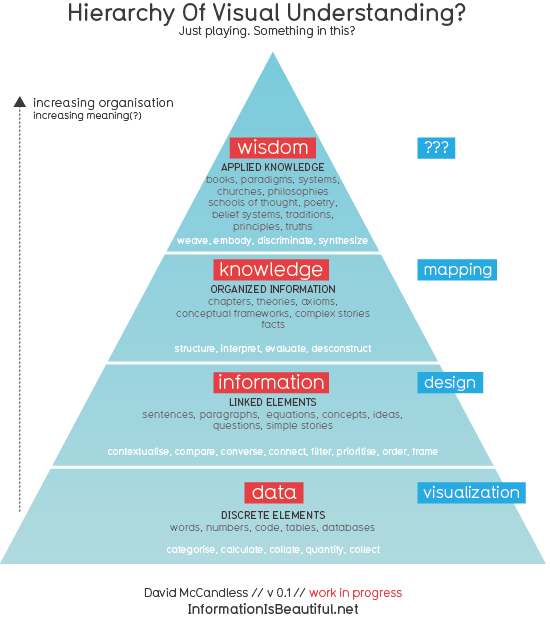
Data, Information, Knowledge, Wisdom?

Just a think-piece really.
(I was recently visiting the office of the awesome design website Swiss Miss. Over snacks, they asked me to christen their “lunch guest wall” with a scribble. Caught in the headlights and feeling the pressure to be clever and impressive, my mind, of course, went blank. Spotless white. All I had was a noodle in my notepad about the increasing organisational structure of information and how it might relate to visualization. It had been a *long* flight to NY.)
I got kinda stuck with it. So I wanted to open it up and see what you thought.
This is by no means original thought. This structure has been around for a while. (In fact does anyone knows who first came up with it?). The only new thing is relating it to visuals. And giving it a nice font.
One interesting thing. If you visualise information without designing it, you often end up with a mush or a meaningless thicket. So if you can only really ‘design’ information, rather than visualize it, then maybe the term ‘information visualization’ is a bit of a misnomer?
Anyway, how does it look to you? Does it seem logical? Truthful? Do the definitions ring true? What could be the word for the visual depiction of wisdom? Does greater verticality imply greater meaning? Or can errors creep in?
- Bitácora de carlosl.sanchez
- Log in or register to post comments


